

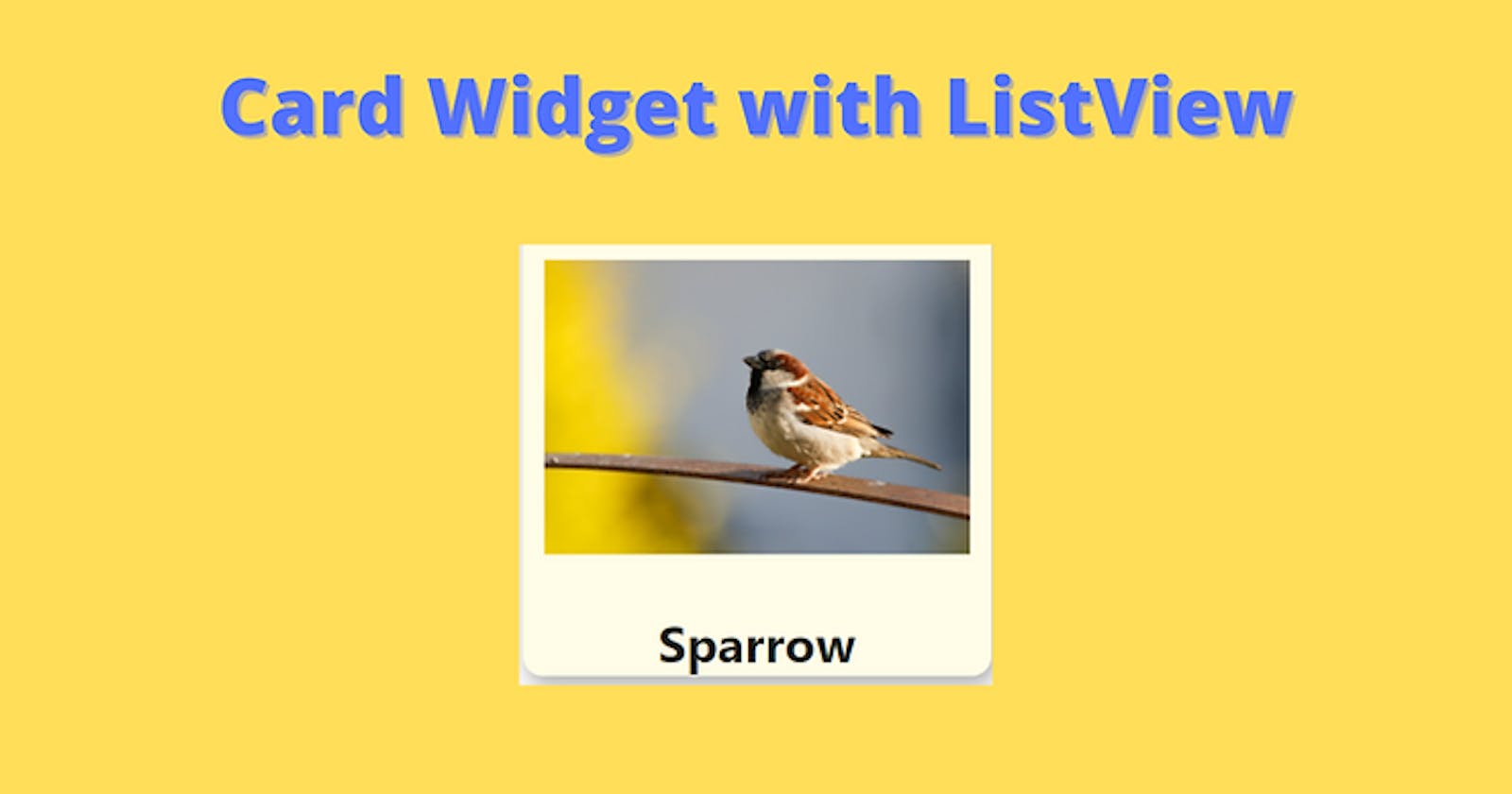
Card View and ListView of Cards using Flutter and Dart. Easy tutorial for Beginners.


Cards are material panels with slightly round corners. The cards make simple apps looks good and easy to use interface. Many apps you come daily across use here and their cards. And with the Flutter framework, we can easily make beautiful cards with absolutely no other dependencies. We will also cover cards in a list in this tutorial.
Project Setup
It would be recommended to create a new project and follow this tutorial and later implement it in your project. But you can also use your project.
So use your project or create a new project in Android Studio or Visual Studio Code and name it list_cards or you can use Command Prompt / Terminal to create a new project.
flutter create list_card
Code
Create a new file under the lib folder to keep our code separate and name it list_cards_screen.dart.
After that make a stateful class in the file and name it simply ListCardsScreen.
import 'package:flutter/material.dart';

class ListCardsScreen extends StatefulWidget {
  const ListCardsScreen({Key? key}) : super(key: key);

  @override
  _ListCardsScreenState createState() => _ListCardsScreenState();
}

class _ListCardsScreenState extends State<ListCardsScreen> {
  @override
  Widget build(BuildContext context) {
    return Scaffold();
  }
}
Add appbar and body to the Scaffold widget and give some title(e.g.- 'Cards List') to your appbar. In the body of the Scaffold widget, we will use a ListView and we will Card as children of ListView. Your code should look as shown below.
appBar: AppBar(
  title: Text('Cards List'),
),
body: ListView(
  children: [],
),
Now let us make two Card widgets. But before that, we will discuss the fields in the Card widget and what we are going to use here.
color: Here colour of the background the Card widget is given.
child: Here we are going to specify what to place inside our Card widget. For our tutorial, I am going to use an image and a text heading.
shadowColor: Here colour of the shadow of the Card widget is given.
elevation: It takes a double value and simply specifies the length of the shadow. Its default value is 1.0.
shape: Here the shape of the border is given, whether you want a rounded or sharp corner for your Card widget. It takes the ShapeBorder type of value.
borderOnForeground: It takes bool value and specifies whether to display border above or below the child widget. The default value is true.
margin: This field asks how much margin to provide and accepts EdgeInsets type value. Its default value is EdgeInsets.all(4.0).
clipBehaviour: Asks whether you want to clip your contents or not. The default value is true.
Let's start making our app.
We will use a Column in the child field of Card. Here we will use an Image widget and a Text widget.
Card(
  child: Column(
    children: [
      Image.network(src),
      Text(title),
    ],
  ),
)
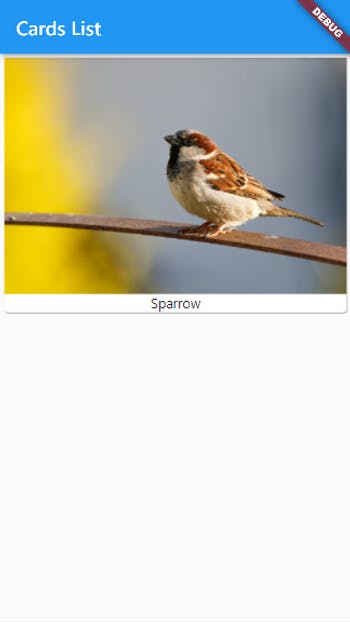
Here is the data we are using now.
String src = 'https://cdn.pixabay.com/photo/2021/06/01/07/03/sparrow-6300790_960_720.jpg';
String title = 'Sparrow';
//https://pixabay.com/users/schauhi-2509795/
Copy and paste above the Widget build function.
Now run the app and see. It should look as shown below.
Design
Now, this apps works but we need to add some more data and design a better card. So let's make a new Card widget function separate from the ListCardsScreen class and we will return the Card widget.
This function will accept the image link and title of the image. Now your Card code should look like below.
Widget card(String image, String title) {
  return Card();
}
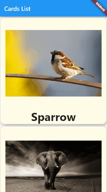
We will give the card a background colour of light yellow and give image padding and an image ratio of 3:4. We will give the title bold font with a bigger font size. So it's your choice completely how you want to design your card. Also, I am going to give the card a more rounded corner.
Widget card(String image, String title, BuildContext context) {
  return Card(
    color: Colors.yellow[50],
    elevation: 8.0,
    margin: EdgeInsets.all(4.0),
    shape: RoundedRectangleBorder(borderRadius: BorderRadius.circular(15)),
    child: Column(
      children: [
        Padding(
          padding: EdgeInsets.all(16.0),
          child: Image.network(
            image,
            height: MediaQuery.of(context).size.width * (3 / 4),
            width: MediaQuery.of(context).size.width,
          ),
        ),
        Text(
          title,
          style: TextStyle(
            fontSize: 38.0,
            fontWeight: FontWeight.w700,
          ),
        ),
      ],
    ),
  );
}
Now in we are going to replace the ListView with ListView.builder. But before that, I have provided some data here which is needed for ListView of our app. So copy that from below.
List<String> image = [
  'https://cdn.pixabay.com/photo/2021/06/01/07/03/sparrow-6300790_960_720.jpg',
  'https://cdn.pixabay.com/photo/2017/10/20/10/58/elephant-2870777_960_720.jpg',
  'https://cdn.pixabay.com/photo/2014/09/08/17/32/humming-bird-439364_960_720.jpg','https://cdn.pixabay.com/photo/2018/05/03/22/34/lion-3372720_960_720.jpg'];
List<String> title = ['Sparrow', 'Elephant', 'Humming Bird', 'Lion'];
Now come to the ListView part of the code and rename the ListView to ListView.builder.
body: ListView.builder(),
Now one required argument in this widget is itemBuilder which will build our card views. So add it to your ListView as shown.
ListView.builder(
    itemBuilder: (BuildContext context, int index) {  },
),
Now in the curly braces, we have to return any widget and for this tutorial, we will return the custom card widget we made.
itemBuilder: (BuildContext context, int index) {
  return card(image[index], title[index], context);
},
We will also require the itemCount field in our ListView.builder so add it and we will provide the length of the data lists we are using(image list and title list). So our whole ListView.the builder should look as follows.
ListView.builder(
  itemCount: image.length,
  itemBuilder: (BuildContext context, int index) {
    return card(image[index], title[index], context);
  },
),
Now run the app again and see the result.
Result
So we have successfully made an app with cards and ListView and by following this tutorial you can make many wonderful apps. Thank you for following this tutorial and if you have any doubts comment below or you can contact me from the contact form.