

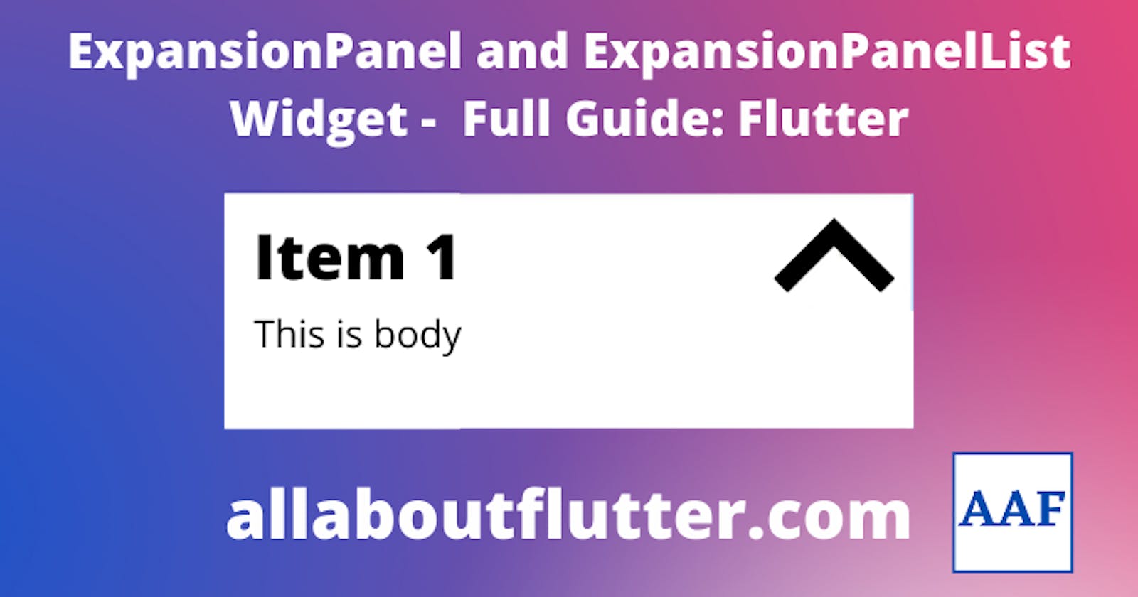


ExpansionPanel is a widget that can be expanded to show full details or closed to hide details and show only the title of the item. These widgets are particularly helpful in the case of applications that have a lot of content to display, we can wrap some content under a headline to show/hide those content.
ExpansionPanelList is a widget that contains the list of ExpansionPanel widgets.
What is ExpansionPanel Widget?
ExpansionPanel is a material panel widget that is of type ExpansionPanel and not a widget. That means we can use the ExpansionPanel widget only as a child of ExpansionPanelList. ExpansionalPanel has two required parameters that are:-
headerBuilder: It is the widget builder for the header or headline of the ExpansionPanel.
body: This parameter asks for the widget that is to be displayed when the item is expanded.
Not required but necessary fields.
canTapOnHeader: This field asks whether the header can be tapped or not to expand or collapse the panel.
isExpanded: It is a necessary but not required parameter. This accepts a boolean value that asks whether the panel should be expanded or collapsed.
Other fields.
- backgroundColor: This field asks for the background colour of the body of ExpansionPanel.
The ExpansionPanel has a expand/collapse IconButton which when pressed, triggers a callback of ExpansionPanelList.
What is ExpansionPanelList Widget?
ExpansionPanel as discussed above should be the child of only ExpansionPanelList. As from the name we can see that it is a list. That means more than one ExpansionPanel can be the child of the ExpansionPanelList widget. Whenever the expand/collapse button is pressed of any children widget, this widget receives the index and the value of the current state of the respective ExpansionPanel. The ExpansionPanelList widget does not have any required parameters but the children field and animationDuration cannot be null. Since animationDuration has a default value, we don't need to care about it. Here are some parameters/fields that are generally used.
expansionCallback: This callback is provided with two values, index and the isExpanded value of the item. Necessary actions are performed to make the ExpansionPanel work as required.
children: This is a field that asks for the List of ExpansionPanel widgets.
animationDuration: The duration that is taken by the ExpansionPanel widget to expand or collapse is specified here.
Other fields.
dividerColour: The colour that needs to appear in between two panels as a divider to make them visually separate. The default value is according to the theme of the MaterialApp. It accepts a Color value.
elevation: The elevation of the panel when the widget is in the expanded state. The default value is 2. It accepts a double value.
expandedHeaderPadding: It is the padding that needs to appear around the panel. The default value is EdgeInsets with vertical padding of 16px.
How to create ExpansionPanel and ExpansionPanelList?
There are numerous ways to create these widgets and we are going to choose the easiest path. Our approach is as follows:
Create an Item class
The class will contain three fields:-
headText type of string and required.
expandedText type of string and required.
isExpanded type of boolean and default to false.
Here is the code for the class
class ExpandingItem {
  ExpandingItem({
    required this.expandedText,
    required this.headerText,
    this.isExpanded = false,
  });

  String expandedText;
  String headerText;
  bool isExpanded;
}
Function to generate the list of Expansion Panels
This function will generate a list of ExpansionPanels using the List.generate() function. This function takes a single parameter that is the number of items.
List<ExpandingItem> generateItems(int numberOfItems) {
  return List<ExpandingItem>.generate(numberOfItems, (int index) {
    return ExpandingItem(
      headerText: 'Item ${index + 1}',
      expandedText:
          'Welcome to AllAboutFlutter. This is item number ${index + 1}',
    );
  });
}
Display the items
First, we need to wrap the ExpansionPanelList under the SingleChildScrollView otherwise we may get RenderOverflow errors.
SingleChildScrollView(
  child: ExpansionPanelList(
  ),
),
Now add the children field to the ExpansionPanelList. To create the list, use the function we created above.
final List<ExpandingItem> _items = generateItems(5);
Now map the list for children parameter. It will return an ExpansionPanel widget.
ExpansionPanelList(
  ...
  children: _items.map<ExpansionPanel>((ExpandingItem item) {
    return ExpansionPanel(
      ...
    );
  }).toList(),
),
Now add the headerBuilder, body and isExpanded fields.
ExpansionPanel(
  headerBuilder: (BuildContext context, bool isExpanded) {
    return ListTile(
      title: Text(item.headerText),
    );
  },
  body: ListTile(
    title: Text(item.expandedText),
  ),
  isExpanded: item.isExpanded,
);
Now add the expansionCallback function that will expand or collapse the item based on the state of the item.
ExpansionPanelList(
  expansionCallback: (int index, bool isExpanded) {
    setState(() {
      _items[index].isExpanded = !isExpanded;
    });
  },
  ...
),
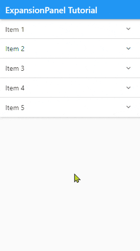
Output
Save and run the code.
Here is the full code.
class ExpandingItem {
  ExpandingItem({
    required this.expandedText,
    required this.headerText,
    this.isExpanded = false,
  });

  String expandedText;
  String headerText;
  bool isExpanded;
}

List<ExpandingItem> generateItems(int numberOfItems) {
  return List<ExpandingItem>.generate(numberOfItems, (int index) {
    return ExpandingItem(
      headerText: 'Item ${index + 1}',
      expandedText:
          'Welcome to AllAboutFlutter. This is item number ${index + 1}',
    );
  });
}

class ExpansionPanelTutorial extends StatefulWidget {
  const ExpansionPanelTutorial({Key? key}) : super(key: key);

  @override
  State<ExpansionPanelTutorial> createState() => _ExpansionPanelTutorialState();
}

class _ExpansionPanelTutorialState extends State<ExpansionPanelTutorial> {
  final List<ExpandingItem> _items = generateItems(5);

  @override
  Widget build(BuildContext context) {
    return Scaffold(
      appBar: AppBar(
        title: const Text("ExpansionPanel Tutorial"),
      ),
      body: SingleChildScrollView(
        child: ExpansionPanelList(
          expansionCallback: (int index, bool isExpanded) {
            setState(() {
              _items[index].isExpanded = !isExpanded;
            });
          },
          children: _items.map<ExpansionPanel>((ExpandingItem item) {
            return ExpansionPanel(
              headerBuilder: (BuildContext context, bool isExpanded) {
                return ListTile(
                  title: Text(item.headerText),
                );
              },
              body: ListTile(
                title: Text(item.expandedText),
              ),
              isExpanded: item.isExpanded,
            );
          }).toList(),
        ),
      ),
    );
  }
}