


The FloatingActionButton widget in Flutter is a small circular icon button that hovers over the application's content to promote an action that can be performed on the application. Usually, a single FAB(FloatingActionButton) widget is generally used. Flutter provides a clean Material UI button that can be easily placed and customized.
In this tutorial, we are going to learn to implement the FloatingActionButton widget.
Basic Syntax
The basic way to create a FloatingActionButton in Flutter is as follows:
Scaffold(
  appBar: AppBar(
    title: const Text('TextButton.styleFrom() Tutorial'),
  ),
  floatingActionButton: FloatingActionButton(onPressed: () {}),
  body: Container(),
);
Creating A FloatingActionButton with an Icon widget
First, we create the FAB as follows:
FloatingActionButton(
  onPressed: () {},
  child: const Icon(Icons.check),
),
Next, we place it in the Scaffold field of FloatingActionButton and display it as follows:
import 'package:flutter/material.dart';

void main() {
  runApp(const MyApp());
}

class MyApp extends StatelessWidget {
  const MyApp({Key? key}) : super(key: key);
  @override
  Widget build(BuildContext context) {
    return MaterialApp(
      title: 'AllAboutFlutter',
      theme: ThemeData(
        primarySwatch: Colors.blue,
      ),
      debugShowCheckedModeBanner: false,
      home: const FABTutorial(),
    );
  }
}

class FABTutorial extends StatelessWidget {
  const FABTutorial({Key? key}) : super(key: key);

  @override
  Widget build(BuildContext context) {
    return Scaffold(
      appBar: AppBar(
        title: const Text('FAB Tutorial'),
      ),
      floatingActionButton: FloatingActionButton(
        onPressed: () {},
        child: const Icon(Icons.check),
      ),
      body: const Center(
        child: Text(
          "Welcome to AllAboutFlutter.com",
          style: TextStyle(fontSize: 32.0),
        ),
      ),
    );
  }
}
The output is as follows:
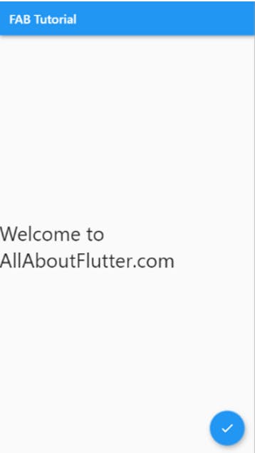
Performing Action using FloatingActionButton
We use the FloatingAction to perform some actions. So in this example, we will change the Text using the FloatingActionButton. We use the onPressed() function for it. Here is the code for it
import 'package:flutter/material.dart';

void main() {
  runApp(const MyApp());
}

class MyApp extends StatelessWidget {
  const MyApp({Key? key}) : super(key: key);
  @override
  Widget build(BuildContext context) {
    return MaterialApp(
      title: 'AllAboutFlutter',
      theme: ThemeData(
        primarySwatch: Colors.blue,
      ),
      debugShowCheckedModeBanner: false,
      home: const FABTutorial(),
    );
  }
}

class FABTutorial extends StatefulWidget {
  const FABTutorial({Key? key}) : super(key: key);

  @override
  State<FABTutorial> createState() => _FABTutorialState();
}

class _FABTutorialState extends State<FABTutorial> {
  String text = "WELCOME TO";

  @override
  Widget build(BuildContext context) {
    return Scaffold(
      appBar: AppBar(
        title: const Text('FAB Tutorial'),
      ),
      floatingActionButton: FloatingActionButton(
        onPressed: () {
          setState(() {
            text = "allaboutflutter.com";
          });
        },
        child: const Icon(Icons.check),
      ),
      body: Center(
        child: Text(
          text,
          style: const TextStyle(fontSize: 32.0),
        ),
      ),
    );
  }
}
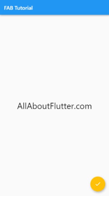
Output

Changing the background colour of the FloatingActionButton
In this example, we will change the background colour of the FAB using the backgroundColour.
FloatingActionButton(
  onPressed: () {},
  backgroundColor: Colors.amber,
  child: const Icon(Icons.check),
),
Here is the code.
import 'package:flutter/material.dart';

void main() {
  runApp(const MyApp());
}

class MyApp extends StatelessWidget {
  const MyApp({Key? key}) : super(key: key);
  @override
  Widget build(BuildContext context) {
    return MaterialApp(
      title: 'AllAboutFlutter',
      theme: ThemeData(
        primarySwatch: Colors.blue,
      ),
      debugShowCheckedModeBanner: false,
      home: const FABTutorial(),
    );
  }
}

class FABTutorial extends StatelessWidget {
  const FABTutorial({Key? key}) : super(key: key);

  @override
  Widget build(BuildContext context) {
    return Scaffold(
      appBar: AppBar(
        title: const Text('FAB Tutorial'),
      ),
      floatingActionButton: FloatingActionButton(
        onPressed: () {},
        backgroundColor: Colors.amber,
        child: const Icon(Icons.check),
      ),
      body: const Center(
        child: Text(
          "AllAboutFlutter.com",
          style: TextStyle(fontSize: 32.0),
        ),
      ),
    );
  }
}
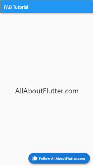
Output
Displaying Text and Icon simultaneously
In the following example, we will display the Text and icon simultaneously as follows:
FloatingActionButton.extended(
  onPressed: () {},
  backgroundColor: Colors.blue[700],
  label: const Text("Follow AllAboutFlutter.com"),
  icon: const Icon(Icons.thumb_up_off_alt_rounded),
),
Here is the full code.
import 'package:flutter/material.dart';

void main() {
  runApp(const MyApp());
}

class MyApp extends StatelessWidget {
  const MyApp({Key? key}) : super(key: key);
  @override
  Widget build(BuildContext context) {
    return MaterialApp(
      title: 'AllAboutFlutter',
      theme: ThemeData(
        primarySwatch: Colors.blue,
      ),
      debugShowCheckedModeBanner: false,
      home: const FABTutorial(),
    );
  }
}

class FABTutorial extends StatelessWidget {
  const FABTutorial({Key? key}) : super(key: key);

  @override
  Widget build(BuildContext context) {
    return Scaffold(
      appBar: AppBar(
        title: const Text('FAB Tutorial'),
      ),
      floatingActionButton: FloatingActionButton.extended(
        onPressed: () {},
        backgroundColor: Colors.blue[700],
        label: const Text("Follow AllAboutFlutter.com"),
        icon: const Icon(Icons.thumb_up_off_alt_rounded),
      ),
      body: const Center(
        child: Text(
          "AllAboutFlutter.com",
          style: TextStyle(fontSize: 32.0),
        ),
      ),
    );
  }
}
Output
Properties: The following are the different properties for FAB:
autofocus(bool): If set to true, the widget will be selected as the initial focus when no other node in its scope is currently focused.
backgroundColor(Color): It is used to set the button's background colour.
child(widget): This is the widget below this widget in the tree.
clipBehavior(Clip): This is the content that will be clipped (or not) according to this option.
disabledElevation(double): It set the z-coordinate at which to place this button when the button is disabled (onPressed is null).
elevation(double): It sets the z-coordinate at which to place this button relative to its parent.
enableFeedback(bool): It sets whether detected gestures should provide acoustic and/or haptic feedback.
extendedIconLabelSpacing(double): It sets the spacing between the icon and the label for an extended FloatingActionButton.
extendedPadding(EdgeInsetsGeometry): It sets the padding for an extended FloatingActionButton's content.
extendedTextStyle(TextStyle): It sets the text style for an extended FloatingActionButton's label.
focusColor(Color): It sets the colour to use for filling the button when the button has input focus.
focusElevation(double): It sets the z-coordinate at which to place this button relative to its parent when the button has the input focus.
focusNode(FocusNode): It sets an optional focus node to use as the focus node for this widget.
foregroundColor(Color): It sets the default foreground colour for icons and text within the button.
heroTag(Object): It sets the tag to apply to the button's Hero widget.
highlightElevation(double): It sets the z-coordinate at which to place this button relative to its parent when the user is touching the button.
hoverColor(Color): It sets the colour to use for filling the button when the button has a pointer hovering over it.
hoverElevation(double): It sets the z-coordinate at which to place this button relative to its parent when the button is enabled and has a pointer hovering over it.
isExtended(bool): If set to true, the FloatingActionButton is extended.
materialTapTargetSize(MaterialTapTargetSize): It configures the minimum size of the tap target.
mini(bool): If set to true, the FloatingActionButton is of mini size.
mouseCursor(MouseCursor): It sets the cursor for a mouse pointer when it enters or is hovering over the button.
onPressed(Callback function): It is the callback that is called when the button is tapped or otherwise activated.
shape(ShapeBorder): It is used to set the shape of the button's Material.
splashColor(Color): It is used to set the splash color for this FloatingActionButton's InkWell.
tooltip(String): It is the text that describes the action that will occur when the button is pressed.