

Flutter: DatePicker Tutorial both with Material and Cupertino Style


DatePicker is very important when you want the user to pick his / her date of birth or something else. In Flutter, implementing DatePicker is very easy and we will implement DatePicker in both Android or Material style and Cupertino or IOS style.
Approach
Flutter has widgets for everything and even for DatePicker. The DatePicker widget is loaded with all needed animation and colours. So implementation is very easy.
Project Setup
No extra plugins are required for this project and you can continue with your existing project.
Here is the starting code.
class DatePickerTutorial extends StatefulWidget {
  const DatePickerTutorial({Key? key}) : super(key: key);

  @override
  _DatePickerTutorialState createState() => _DatePickerTutorialState();
}

class _DatePickerTutorialState extends State<DatePickerTutorial> {
  String dob = "";
  @override
  Widget build(BuildContext context) {
    return Scaffold(
      appBar: AppBar(
        title: Text("DatePicker Tutorial"),
      ),
      body: Center(
        child: Column(
          mainAxisAlignment: MainAxisAlignment.spaceEvenly,
          children: [
            Text(
              "Your Date of Birth",
              style: TextStyle(
                fontSize: 32.0,
              ),
            ),
            Text(dob),
            OutlinedButton(
              onPressed: () {
                // TODO: Implement pick date
              },
              child: Text("Select Date"),
              style: OutlinedButton.styleFrom(
                primary: Colors.white,
                backgroundColor: Colors.indigo[600],
                textStyle: TextStyle(
                  fontSize: 32,
                  color: Colors.white,
                ),
              ),
            )
          ],
        ),
      ),
    );
  }
}
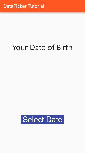
Run the code and the result will be as follows.

As you can see we have set up our UI. Only DatePicker is left so let's implement it in the next section.
Material Style
In Flutter, we have a function called showDatePicker() which when called shows the DatePicker dialog where the user selects a date.
showDatePicker() returns Future<DateTime?> type of data. So it is an asynchronous function. Also when the user presses the cancel button, it returns a null value.
Let's implement it in our app.
In the TODO line, remove the line and add the following code.
showDatePicker(
  context: context,
  initialDate: ,
  firstDate: ,
  lastDate: ,
);
It has four required fields.
context: The context is passed for the reference on where to show it. Simply pass the context.
initialDate: It is the initial date of selection you want. Pass any date and time you want in range in DateTime form
firstDate: It is the initial date of selection you want. If you want every applicant to be born after 2002 then pass DateTime(2002).
lastDate: It is the last date which the user can select. If you want the Date of Birth as in our case we will pass DateTime.now().
Now also I want to store the Date that is selected. So here is the code for that.
onPressed: () async {
  DateTime? date = await showDatePicker(
    context: context,
    initialDate: DateTime.now(),
    firstDate: DateTime(1950),
    lastDate: DateTime.now(),
  );
  if (date != null)
    setState(() {
      dob = "${date.day} / ${date.month} / ${date.year}";
    });
},
Here the initialDate and lastDate is DateTime.now() and the firstDate that the user can select is after 1950.
Now run the code.

Cupertino Style
The default date picker is of Material style.
The approach of CupertinoDatePicker is different. First, we need to initialize CupertinoDatePicker with the initialDate, minimumDate and maximumDate and then we have a function called showCupertinoModelPopup function which shows a ModalBottomSheet. In the build method, we will return the date picker.
Here is the code for that.
CupertinoDatePicker datePicker = CupertinoDatePicker(
  backgroundColor: Colors.white,
  minimumDate: DateTime(1950),
  initialDateTime: DateTime.now(),
  maximumDate: DateTime.now(),
  mode: CupertinoDatePickerMode.date,
  onDateTimeChanged: (date) {
    setState(() {
      dob = "${date.day} / ${date.month} / ${date.year}";
    });
  },
);
showCupertinoModalPopup(
  context: context,
  builder: (context) {
    return Container(
      height: 200,
      child: datePicker,
    );
  },
);
Here in the CupertinoDatePicker, we have a required field and that's onDateTimeChangedFunction which has a parameter of the selected date. So whenever the user changes the date, we will update it using the setState((){}) function.
Run the code and see the result.
Conclusion
We have learned how to implement DatePicker in both Material And Cupertino style. Hope you liked the tutorial and if you have any doubts comment below.