


An IconButton widget is simply an Icon widget with a clicking callback feature. We get the same functionality as that of ElevatedButton but instead of Text or any other widget, we use Icons.
In this tutorial, we are going to learn and implement the IconButton widget and also learn to style it.
Properties:
Below we have mentioned the properties of the IconButton widget.
Required Properties
icon: Here we provide the Icon widget and the Icon's size and colour are configured automatically according to the IconTheme.
onPressed(): This callback function is used when the button is clicked.
Other Properties:
key(Key): Here we provide the key.
iconSize(double): Here we provide the size of the icon. The default size is 24.0.
visualDensit(VisualDensity): It defines how compact the icon button's layout will be.
padding(EdgeInsetsGeometry): Here we provide the padding. The default value is EdgeInsets.all(8.0).
alignment(AlignmentGeometry): Here we provide the alignment of the Icon. The default value is Alignment.center.
splashRadius(double): It defines the radius of the material splash when the button is tapped.
color(Color): The colour to use for the icon inside the button if the icon is enabled. The default value is left upon its ancestor widgets.
focusColor(Color): The color for the button when it has the input focus.
hoverColor(Color): The color for the button when a pointer is hovering over it.
highlightColor(Color): The secondary color of the button when the button is in the down (pressed) state.
splashColor(Color): It is the primary color of the button when the button is in the down (pressed) state.
disabledColor(Color): It is the color to use for the icon inside the button if the icon is disabled.
mouseCursor(MouseCursor): It is used to set the cursor for a mouse pointer when it enters or is hovering over the button.
focusNode(FocusNode): It is an optional focus node to use as the focus node for this widget.
autofocus(bool): This field is used to specify that the widget is required to be autofocused or not. The default value is false.
tooltip(String): Tooltip is a message that appears above the widget when hovered over it. It is generally used to display the action that the button performs.
enableFeedback(bool): This is used to enable or disable the haptic feedback on Android and IOS devices. The default value is true.
constraints(BoxConstraints): Optional size constraints for the button is provided here.
style(ButtonStyle): This is used to change the default style of button.
isSelected(bool): It acts as optional selection state of the icon button.
selectedIcon(Widget): If button is selected, this Icon widget will be shown.
Syntax
We create a Icon button as follows:
IconButton(
  onPressed: () {},
  icon: const Icon(Icons.add),
),
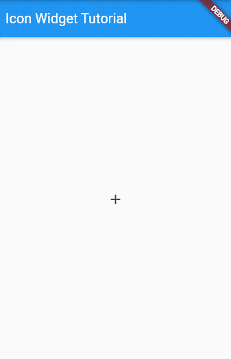
Basic Example
Here we have a basic IconButton and when pressed it shows a Snackbar.
main.dart
import 'package:flutter/material.dart';

void main() {
  runApp(const MyApp());
}

class MyApp extends StatelessWidget {
  const MyApp({Key? key}) : super(key: key);

  @override
  Widget build(BuildContext context) {
    return MaterialApp(
      title: 'AllAboutFlutter',
      theme: ThemeData(
        primarySwatch: Colors.blue,
      ),
      home: const IconButtonWidgetTutorial(),
    );
  }
}

class IconButtonWidgetTutorial extends StatelessWidget {
  const IconButtonWidgetTutorial({Key? key}) : super(key: key);

  @override
  Widget build(BuildContext context) {
    return Scaffold(
      appBar: AppBar(
        title: const Text('Icon Widget Tutorial'),
      ),
      body: Center(
        child: IconButton(
          onPressed: () {
            ScaffoldMessenger.of(context).showSnackBar(
              const SnackBar(
                content: Text('Icon Button Clicked'),
              ),
            );
          },
          icon: const Icon(Icons.add),
        ),
      ),
    );
  }
}
Output
Showing Tooltip
In the following example, we are showing a tooltip on hovering over the IconButton.
main.dart
import 'package:flutter/material.dart';

void main() {
  runApp(const MyApp());
}

class MyApp extends StatelessWidget {
  const MyApp({Key? key}) : super(key: key);

  // This widget is the root of your application.
  @override
  Widget build(BuildContext context) {
    return MaterialApp(
      title: 'AllAboutFlutter',
      theme: ThemeData(
        primarySwatch: Colors.blue,
      ),
      home: const IconButtonWidgetTutorial(),
    );
  }
}

class IconButtonWidgetTutorial extends StatelessWidget {
  const IconButtonWidgetTutorial({Key? key}) : super(key: key);

  @override
  Widget build(BuildContext context) {
    return Scaffold(
      appBar: AppBar(
        title: const Text('Icon Widget Tutorial'),
      ),
      body: Center(
        child: IconButton(
          onPressed: () {
            ScaffoldMessenger.of(context).showSnackBar(
              const SnackBar(
                content: Text('Icon Button Clicked'),
              ),
            );
          },
          icon: const Icon(Icons.add),
          tooltip: "Follow AllAboutFlutter",
        ),
      ),
    );
  }
}
Output
